
Fig. 1.
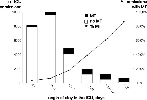
Usage of meropenem in relation to the length of stay (LOS) on the ICU. The bar chart depicts all ICU admissions during 2013–2015 (left vertical axis), black bars indicate the number of admissions with meropenem therapy (MT). The line graph depicts the percentage of admissions treated with meropenem (right vertical axis) in each LOS group