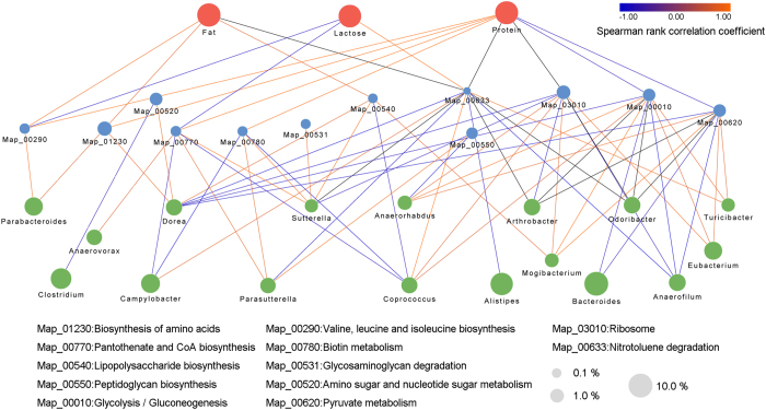
Figure 6. The correlation network of different milk components and typical metabolic pathways with relative genera.
The edge width and colour (red: positive and blue: negative) are proportional to the correlation strength. The node size is proportional to the mean abundance in the respective population.

