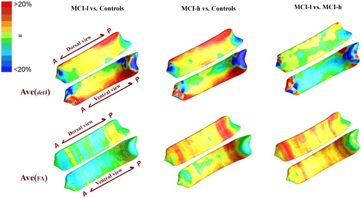
Fig. 3.
Average map of detJ and mean FA between groups are color-coded according to the color bar in the upper left corner. When these results are compared with Fig. 2, we can see the main direction of change: nearly all the significance areas fell in the Controls > MCI-l, Controls > MCI-h, as well MCI-l > MCI-h areas.

