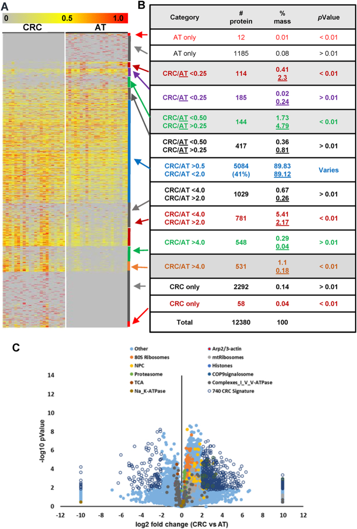
Figure 1. Proteomic characterization of the proteomes of CRC and AT.
(A) A heat map depicting the relative abundance of 12,380 proteins identified across 44 samples (22 CRC and 22 AT). The color key indicates the relative abundance of each protein (0 to 1.0) across 44 samples. (B) A summary of statistical analyses of differentially expressed proteins (right, each color representing a category; ratio of CRC/AT was calculated based on the average of 22 samples). (C) Volcano plot demonstrating the fold change of protein abundance between CRC and AT. The x-axis represents the log2 of fold changes (CRC versus AT), and the y-axis represents the statistically significant p-value (−log10 of p-value, n = 22).

