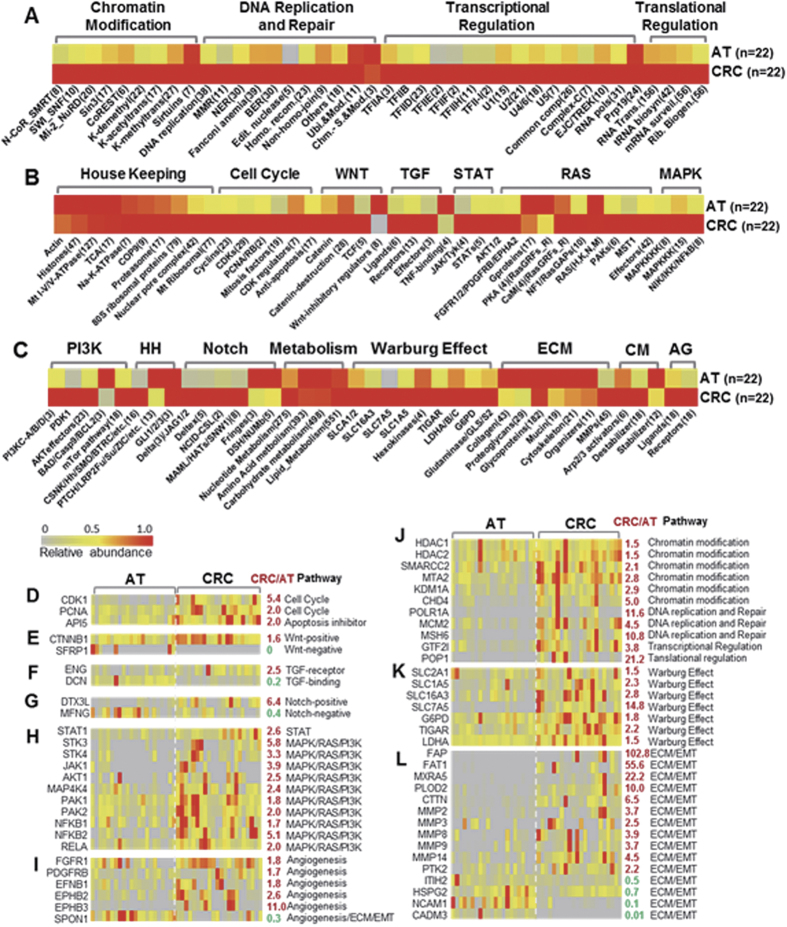
Figure 3. The hallmarks of the proteome transition illustrated by the differential expression of proteins or POCs in analyzed signaling pathways or cellular processes.
(A–C) Heat map panels present comparisons of the relative abundance of pathway protein ontology chains (POC) at an average of 22 paired CRC and AT samples. The averages of 22 CRCs or 22 ATs are displayed as rows, and the POCs are displayed as columns. (D–L) Heat map panels depict comparisons of the relative abundance of selected individual proteins (rows) in analyzed pathways between 22 CRC samples and 22 AT samples (columns). The ratio of the average abundance of 22 CRCs to that of 22 ATs is highlighted in red (up) or green (down). The color key indicates the relative abundance of grouped proteins (0 to 1.0) at average (n = 22) between CRC and AT (A–C) or the relative abundance of individual proteins across 44 CRC and AT samples (D–L). ECM, extracellular matrix; HH, hedgehog; CM, cell motility; AG, angiogenesis. Note: Supplementary Fig. 3 is the full version of the heat maps of all pathways analyzed.

