
FIGURE 1.
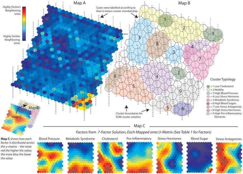
U-Matrix and Components Maps for Nine Allostatic Load Profiles: Map A and Map B are graphic representations of the cluster solution arrived at by the Self-Organizing Map (SOM) Neural Net, referred to as the U-Matrix. In terms of the information, they provide, Map A is a three-dimensional (topographical) u-matrix: for it, the SOM adds hexagons to the original 15×11 map to allow for visual inspection of the degree of similarity among neighboring map units; the dark blue areas indicate neighborhoods of cases that are highly similar; in turn, bright yellow and red areas, as in the lower right comer of the map, indicate highly defined cluster boundaries. Map B is a two-dimensional version of Map A that allows for visual inspection of how the SOM clustered the individual cases. Cases on this version of the u-matrix (as well as Map A) were labeled according to their k-means cluster membership (The nine cluster solution shown in Table 2) to see if the SOM would arrive at a similar solution. Map C is a graphic representation of the relative influence that the seven factors (shown in Table 1) had on the SOM cluster solution. The SOM generates a mini-map for the seven factors, each of which can be overlaid across maps A and B. Each of these mini-maps can then be inspected visually to examine what its rates are across the different neighborhoods (clusters of cases). Dark blue areas indicate the lowest rates for a factor; and the bright red areas indicate the highest rates for a factor. For example, looking at the mini-map for Factor 6 (Blood Sugar), its rates are extremely low across most of the map, except for the lower right comer, which is where (looking at Map A and Map B) the SOM placed Cluster 6.