
FIGURE 2.
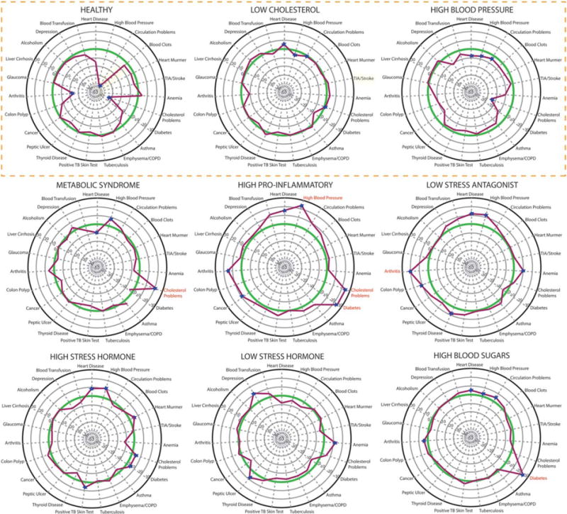
Clinical health risk outcomes for nine allostatic load profiles. This figure displays the differences between observed and expected frequencies for each self-reported medical condition. Each of the radii represents a self-reported medical condition, labeled at the top of their respective radius. The case clusters are circumscribed around the 23 points of each circle based on the average frequency on a particular self-reported medical condition. The resulting profile (which constitutes each Cluster’s health risk profile) is in red. Score higher than 0 (the green circle) indicate a greater observed value than expected, whereas scores below 0 indicate a smaller than observed value than expected. For those scores higher than 20, the corresponding medical condition is labeled in red. The three healthy to marginally healthy profiles are at the top, outlined in orange.