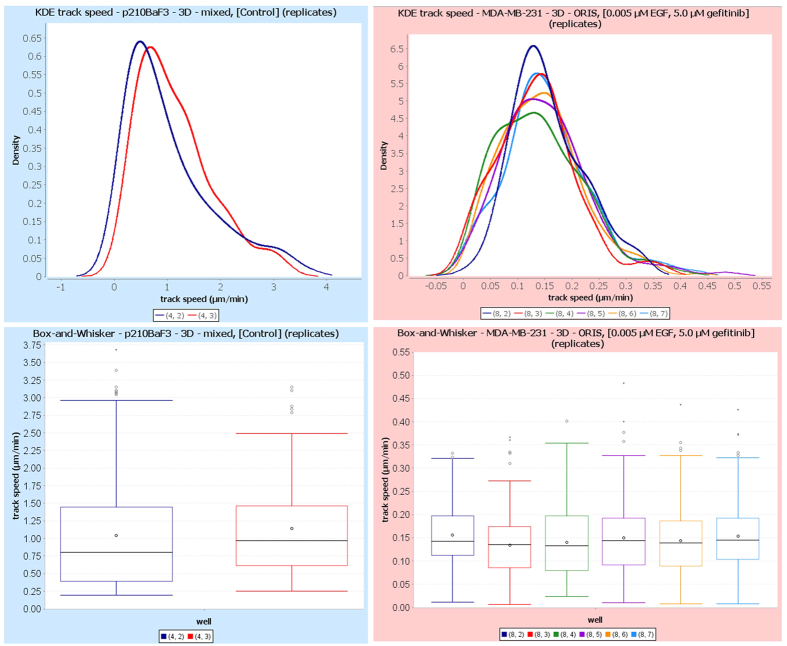
Figure 7. Cell speed distributions are visualized via kernel density estimation (KDE) plots and boxplots.
Speed distributions are shown for the two replicates of condition 3, experiment 1 (untreated p210Bcr-Abl Ba/F3 cells, left), and for the six replicates of condition 7, experiment 2 (0.005 μM EGF + 5.0 μM gefitinib, right). Different colors correspond to different technical replicates or wells, as shown in legends. Note the difference in distribution range for the two cell types, with the immune cells (experiment 1, left) displaying faster migration. The box plots show the median (line) and the mean (point); boxes indicate interquartile ranges (Q1–Q3), while whiskers span the minimum and maximum of the data. Dots represent outliers, and triangles far outliers.

