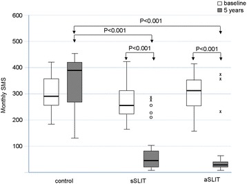
Fig. 1.

Changes in mean monthly symptoms scores (SMS) in the 3 groups of patients at baseline and after treatment. Boxes represent the interquartile range, thick line represents the 2nd quartile (median); whiskers represent extreme values; outliers are represented as empty dots (more than 1.5 times the interquartile distance) or as asterisks (above 3 times the interquartile range). P values indicated above boxes
