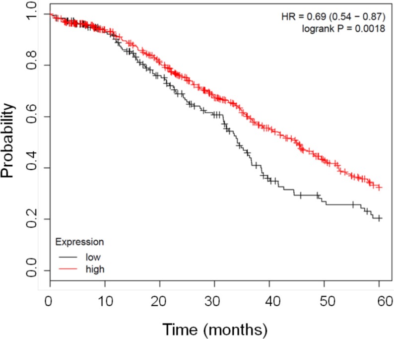
Figure 1. Kaplan Meier curves showing the good prognostic effect on overall survival of the higher expression of FHC gene.
The graph shows the correlation between overall survival and FHC expression in patients affected by ovarian cancer. The red line represents samples with higher FHC expression n = 540 while black line indicates patients with lower FHC expression n = 183. The Kaplan–Meier survival plot was generated by www.kmplot.com/ovar [32].

