Fig. 5.

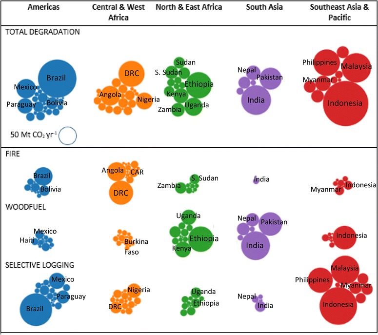
Bubble charts showing degradation emissions by region. The size of the bubbles represents the relative magnitude of annual emissions

Bubble charts showing degradation emissions by region. The size of the bubbles represents the relative magnitude of annual emissions