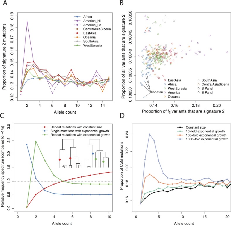
Fig 5. Differences in signature 2 can be explained by demography.
A: The proportion of variants that are in signature 2 for different regions, for allele counts from 1 to 15. B: The proportion of variants that are in signature 2 for f2 variants on the x-axis, and all variants per-genome on the y-axis. Samples in SGDP panel B, processed in a different pipeline, shown as triangles. C: Simulated allele frequency spectra for repeat mutations for 50 haplotypes under the standard (i.e. constant population size) coalescent, and both single and repeat mutations under the coalescent with exponential growth (100-fold in 0.04 Ne generations). The y-axis is scaled by the expected frequency of single mutations in the constant size case (i.e. 1/n). Inset trees show examples of the genealogies obtained–constant size on left, exponential growth on right. Results from 200,000 independent trees. D: Simulation of the proportion of mutations that are at CpG sites at different frequencies, assuming that 15% of all mutations are CpGs and 10% of CpGs are repeat mutations. Compare to A.

