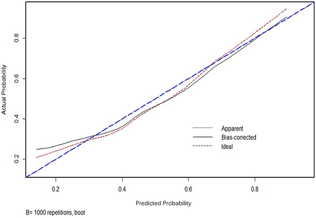
Figure 3. Calibration plot of nomogram.

Dotted line (blue) indicated the ideal nomogram in which predicted and actual probabilities were perfectly identical; Dashed line (red) indicated actual nomogram performance with apparent accuracy; Solid line (black) presented bootstrap corrected performance of our nomogram, scatter estimate of future accuracy.
