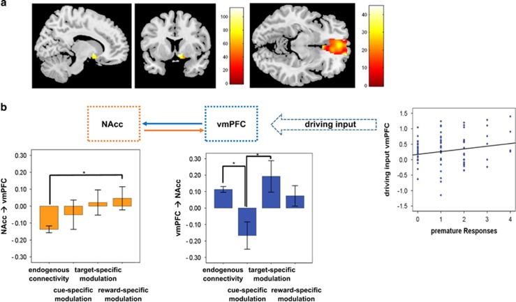
Figure 4.
(a) In the upper row, brain activation in the NAcc and the vmPFC superimposed on a single subject anatomical image. Color bars represent F-scores as revealed by a repeated measures ANOVA, P<0.05, family-wise error correction for multiple comparisons. (b) In the center, the dynamic causal model is represented with squares indication the network regions and the solid arrows the connectivity emerging from one region and going to the second. The dotted arrow represents the driving imput by the vmPFC. Barplots at the right and left end of the lower row represent significant change in connectivity across experimental conditions. Blue represents frontal top-down regions and connectivity and orange reward-related regions and connectivity. The scatterplot shows the significant correlation between the number or premature responses and the driving input by the vmPFC. Statistical threshold for connectivity analyses was P<0.05, corrected for multiple comparisons using the false discovery rate as suggested by Benjamini and Hochberg.46 ANOVA, analysis of variance; NAcc, nucleus accumbens; vmPFC, ventromedial prefrontal cortex.

