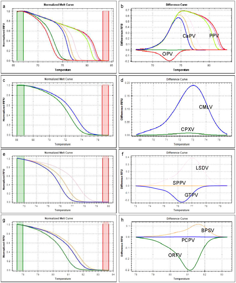
Figure 3. Normalized HRM plots of the PCR products of eight poxviruses.
Three primer pairs were used for the amplification. Each virus genotype clustered separately within the genus. The normalized melt curve and difference curve plots are presented separately with different line colour for each genotype within the genus: for the eight poxviruses (a,b), orthopoxviruses (c,d), capripoxviruses (e,f), and parapoxviruses (g,h), respectively. Green and red columns in the normalized melt curve plot represent pre- and post-melt normalization regions.

