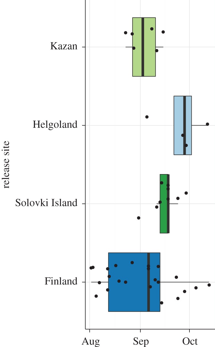
Figure 2.

Timing of migration. The first day of migration was determined for each individual for which tracking data were available during the migratory period. The boxplot shows the distribution of the timing of autumn migration for the different groups. The boxes represent the 25%, 50% (median) and 75% quartiles. The whiskers show the 1.5-fold interquartile ranges. Black dots represent the raw data for each group.
