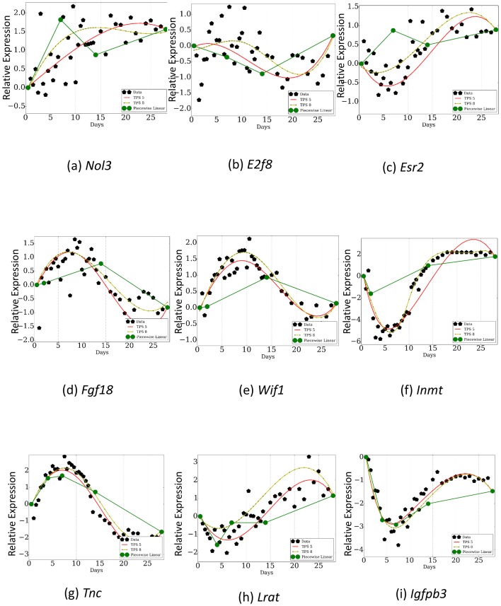
Figure 6. Comparison of TPS with sampling rates used in previous studies.
Dark green curves are the reconstructed profiles based on the points profiled by prior studies. Light green and red curves are based on the points selected by TPS . As can be seen, even when comparing results from using the same number of points, TPS can identify key events for some of the genes that are missed when using the phenotype based sampling rates. Subfigures a,b, and c are a piecewise linear fit over points 0.5, 7.0, 14.0, 28.0 . Subfigures d,e, and f are a piecewise linear fit over points 0.5, 2.0, 14.0, 28.0. Subfigures g,h, and i are a piecewise linear fit over points 0.5, 4.0, 7.0, 14.0, 28.0.


