
Fig. 2.
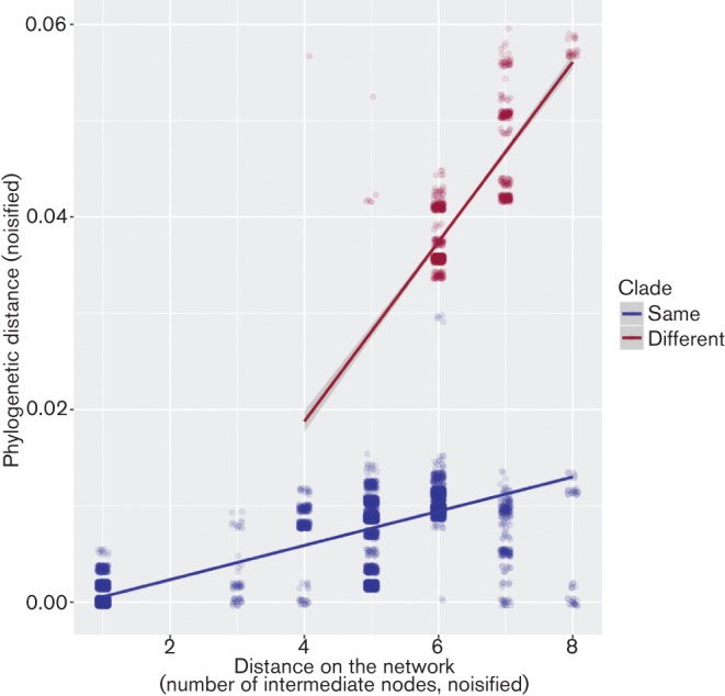
Scatterplot showing the relationship between the phylogenetic distance and the distance between cases on the traceback network, after accounting for the existence of two distinct genetic clades in sampled isolates. Each dot represents a pairwise comparison between two cases. Data have been slightly noisified to better visualise overlapping points. Dots are colored according to clade memberships, with pairs of isolates from the same clade in blue, and from different clades in red. Lines indicate predictions of a linear model using different slopes for each group.