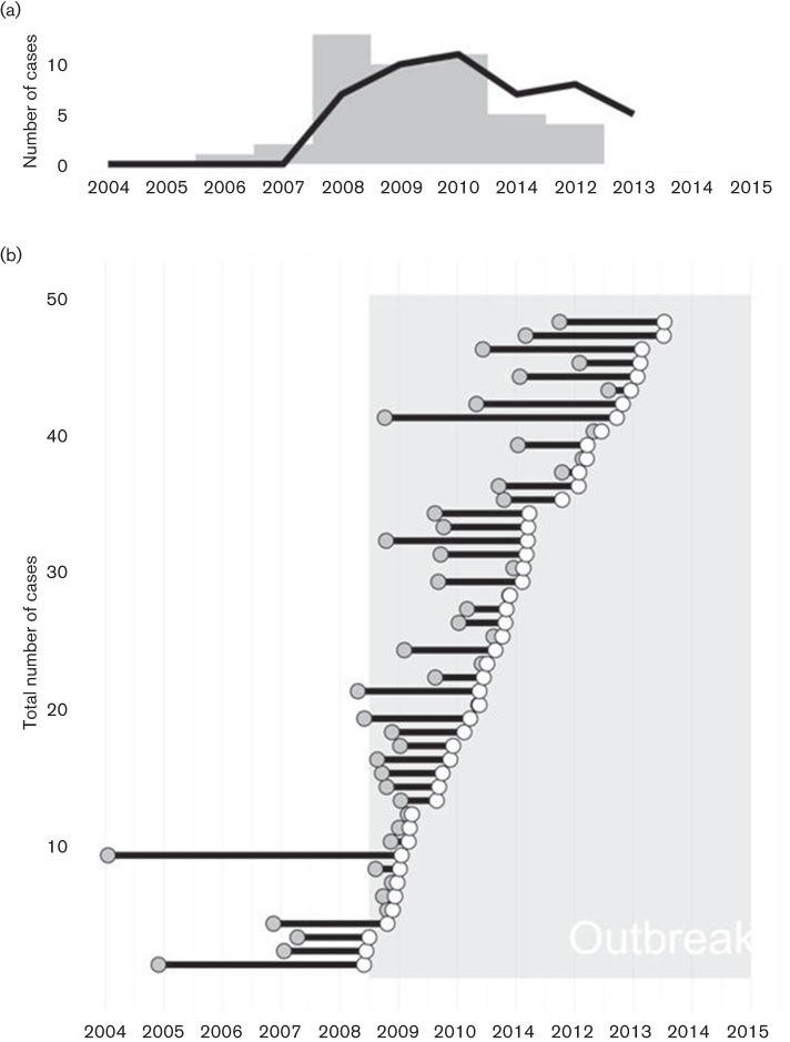
Fig. 1.
Timing of infections inferred from genomic data. (a) Epidemic curve for the outbreak based on time of diagnosis (black line) or Tinf, the time of infection estimated by TransPhylo (grey bars). (b) Infected period for each case shown as a line originating at Tinf (grey dot) and continuing until the case was diagnosed (white dot). The outbreak period (May 2008 – January 2015) is indicated with shading.

