Figure 3.

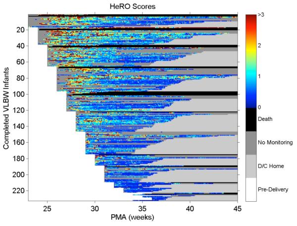
Heat map of HeRO scores: the right hand axis relates the color to the score, with warmer colors denoting higher risk of imminent illness

Heat map of HeRO scores: the right hand axis relates the color to the score, with warmer colors denoting higher risk of imminent illness