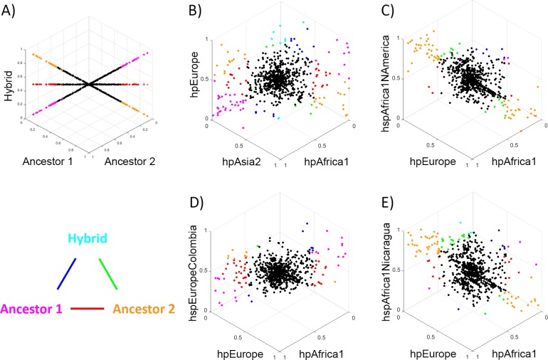
Fig 6. Comparison of accessory gene frequency in a hybrid population with the frequencies in its putative ancestors.
Each dot shows the frequencies of an accessory gene in three populations, with the graphs orientated such that genes with identical frequencies in all three appear at the centre of the plot. Genes with large frequency differences between populations are labelled in colours, according to the triangular legend. Colours shown on the vertices indicate genes that differ substantially between one population and the other two (according to the criteria that X is considered substantially bigger than Y if X–Y > = 0.5, X > = 0.5 and Y < 0.1, or X > 0.9 and Y < = 0.5), while colours on the edges indicate genes where the two populations on the vertices differ substantially in frequency, with the third population having an intermediate frequency. A) Plot showing results obtained if the frequency of genes in the hybrid population is either identical to Ancestor 1 (line ending in magenta), to Ancestor 2 (line ending in orange) or a 50–50 hybrid (line ending in red). B) Comparison between Old world populations hpEurope, hpAsia2 and hpAfrica1, C) Comparison of hspEuropeColombia to hpEurope and hpAfrica, D) Comparison of hspAfrica1Nicaragua to hpEurope and hpAfrica, E) Comparison of hspAfrica1NAmerica to hpEurope and hpAfrica.

