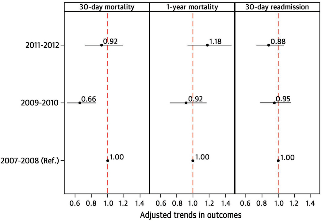
Figure 2.
Risk-adjusted trend in 30-day mortality, 1-year mortality, and 30-day readmission for principal TTC cohort.
The figure is divided vertically into 3 panels (1-year mortality, 30-day mortality, and 30-day readmission). On the vertical axis are the 3 time periods (2007–2008, 2009–2010, 2011–2012, with 2007–2008 serving as reference). Within each panel, the strength of effect is shown along the horizontal axis with the vertical dotted line demarcating an odds ratio (OR) of 1 (i.e., no difference in the risk adjusted outcome compared with 2007–2008); estimates to the right (i.e., >1) are associated with a greater likelihood of the outcome, while those to the left (i.e., <1) indicate a reduced likelihood of the outcome. Each dot represents the point estimate of the effect of that time period in the model, while the line shows the 95% confidence interval (CI).

