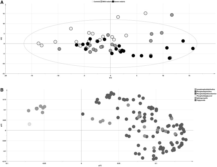
Fig. 2.
Lipidomic representation of patient groups. PCA score (a) and loading (b) plots on lipidomic data with samples colored according to their respective group: a black dots signify severe malaria samples, gray dots mild malaria and blue signify controls. b Lipid species on the loading plot are colored according to chemical classes. The separation of infected subjects and controls according to their lipidomic profiles is visualized in the plot; x axis—t[1] first score, y axis—t[2], second score

