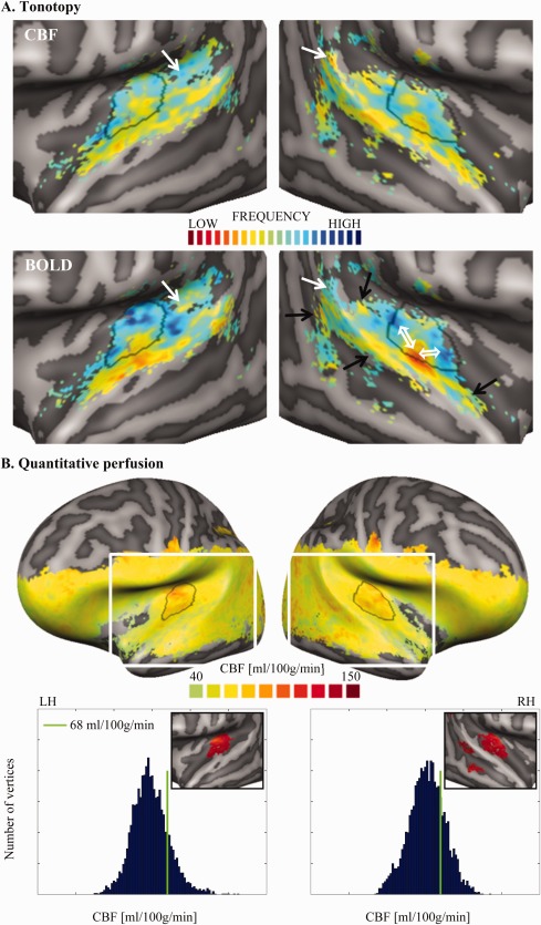
Figure 3.

Group tonotopy (A) and quantitative baseline perfusion (B) maps. Panel A shows the group tonotopy obtained from CBF (top row) and the BOLD signal (bottom row). Overlaid to the right BOLD map, two white double arrows show the main gradients composing the V‐shaped frequency pattern of PAC and the black single arrows show clusters of low frequencies, which might belong to additional gradients outside PAC. Given the symmetry between hemispheres and the good agreement between CBF and BOLD tonotopy, such guiding symbols are presented only in one panel. In both CBF and BOLD tonotopic maps, regions presenting a mismatch between the two maps are indicated by white single arrows. Panel B shows the group quantitative perfusion map and the histograms of the perfusion values separately for the two hemispheres (LH and RH stand for left and right hemisphere, respectively). In the plots, the green bar indicates the threshold of 68 ml/100g/min (corresponding to the 80th percentile of the baseline perfusion in the temporal mask). The white rectangle overlaid to the hemispheres shows the region of the close‐up view used for Panel A and the inserts in the histogram plots below. The inserts show a close‐up view of the thresholded perfusion map (CBF > 68 ml/100g/min; masked with the anatomically defined temporal mask (Figure 2A, blue mask) and 25 mm2 cluster size threshold), in which one can observe a homogeneous high perfusion region centered on HG. The contour of this bilateral region of high perfusion in AC was outlined in black on all other maps. [Color figure can be viewed at http://wileyonlinelibrary.com]
