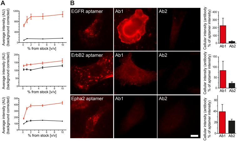
Fig 3. Direct comparison between aptamer and antibody stainings.
(A) Antibody concentration was first titrated to perform optimal live-stained as explained in Fig 1A (Ab1: red trace and Ab2: black trace). Every point in the saturation curves represents the average intensity from 20 to 50 cells imaged with an epifluorescence microscope from at least 3 independent experiments (associated error is displayed as the SEM). All further antibody stainings through out the manuscript were used at 1% v/v (from the original stock concentration provided by the supplier). (B) Equally scaled images to allow a direct comparison between the staining pattern, performance and fluorescence intensity of cells stained with aptamers or antibodies. Scale bar: 5 μm. The bar graphs at the right of each panel show the average intensity of cells stained with antibodies (Ab1 and Ab2) expressed in percentage of the aptamers intensities. Error bars are the SEM from 3–4 independent experiments with more than 30 cells per experiment. Detailed information of all Ab1 and Ab2 antibodies can be found in Table 1 in the Materials and Methods section.

