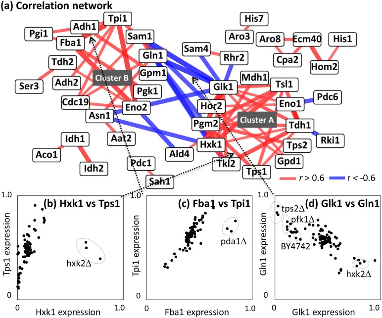
Fig 7. Enzyme-enzyme co-abundance analysis.
(a) Enzyme-enzyme co-abundance network. Nodes and edges indicate enzymes and their correlations. Positive (r > 0.6) and negative (r < -0.6) correlations were indicated as red and blue, respectively. (b-d) Scatter plot between two enzyme expression data including (b) Hxk1 vs. Tps1, (c) Fba1 and Tpi1, and (d) Glk1 vs. Gln1. Dotted arrows indicate corresponding edges between two enzymes. Dotted circles represent data derived from specific mutants.

