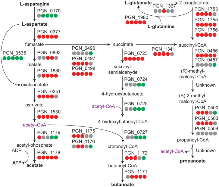
Figure 2.
Metabolic pathway diagram showing amino acid metabolism over the time course for P. gingivalis alone. Each dot represents a comparison of a time point in the course to the T = 1 control, reading from left to right starting with 5 min. Red indicates higher levels, green lower levels, and gray no significant change. Full details for each Pg ORF can be found in Tables S1–S3.

