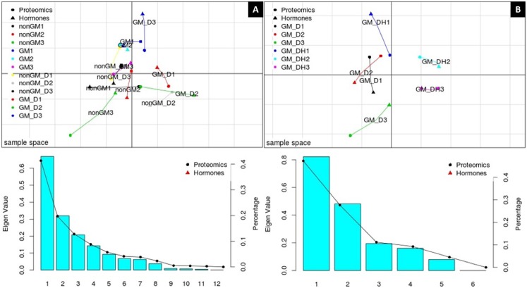
Fig 1. MCIA projection plot.
(A) MCIA projection plot for Experiment 1, representing the proteomic and metabolomic datasets: PC1 = 41.35% and PC2 = 19.73%. (B) MCIA projection plot for Experiment 2, representing the proteomic and metabolomic datasets: PC1 = 47.29% and PC2 = 27.7%. PC1 is represented by the first axis (horizontal), and PC2 is represented by the second axis (vertical). Eigenvalue and Percentage graphics show the amount of variation in the dataset corresponding to each PC. Different symbols represent the respective “omics” analysis and are connected by lines where the length is proportional to the divergence between the data from a same replicate. Lines are joined by a common point, representing the reference structure, which maximizes covariance derived from the MCIA synthetic analysis. Colors represent the biological replicates.

