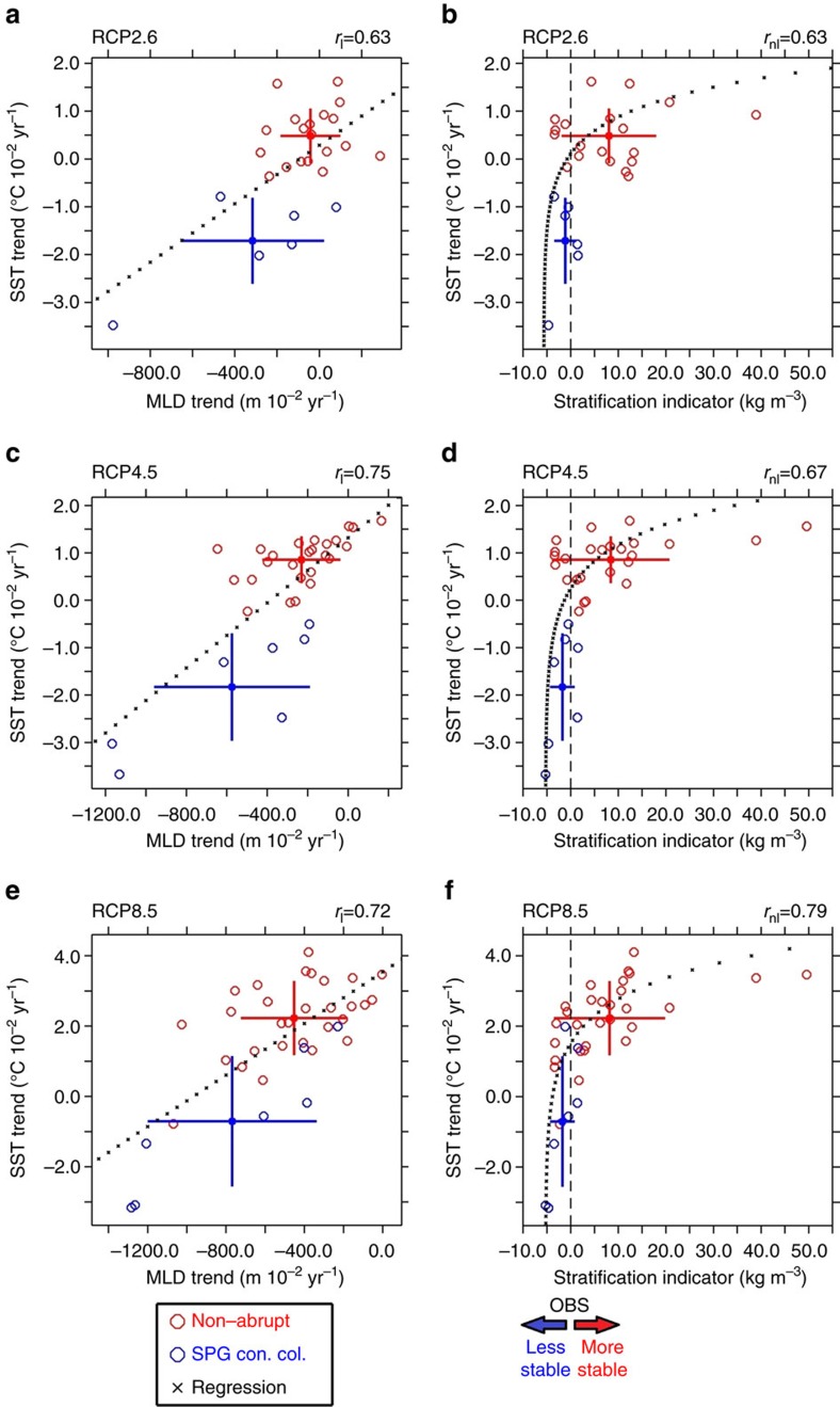
Figure 5. The role of stratification in SPG projections.
Scatterplot of simulated SST trends (oC 10−2 year−1) over the SPG versus (a,c,e) the relevant MLD-trend (m 10−2 year−1) and (b,d,f) the present-day stratification indicator (Kg m−3). Non-abrupt models are indicated with red circles and SPG convection collapse models with blue circles, for (a,b) the RCP2.6, (c,d) the RCP4.5, (e,f) the RCP8.5 scenario. In a,c,e the value rl indicates the linear correlation between the SST and MLD trends, whose significance above the 95% confidence level was evaluated with a two-tailed Student’s t-test. The crosses indicate the linear best-fit of the SST trends against the MLD trend, that is,. the linear regression using the least squares method. In b,d,f the value rnl indicates the non-linear correlation between SST-trend and the stratification indicator, statistically significant at the 95% confidence level (see Methods). The crosses indicate the logarithmic best-fit of the SST trends against the stratification index, that is, the logarithmic regression using the least squares method. The dashed vertical black line centred on 0 indicates the observationally based stratification index, calculated as the average of GLORYS Reanalysis (1993–2012) data and EN3 analysis data (1950–2012). The arrows at the bottom indicate the areas in the panels for which the simulated SPG stratification is either more, or less stable than in the observational data.

