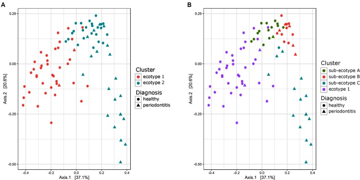
FIGURE 2.
Principal Coordinate Analysis plot comparing Bray–Curtis distance between the samples of the subgingival communities in periodontitis. (A) Samples are color-coded based on a two clusters model (k = 2). (B) Samples are color coded based on a four clusters model (k = 4). The shape of the dots represents the diagnosis of the patient: triangle for healthy/mild periodontitis patient and circle for moderate/severe periodontitis patients.

