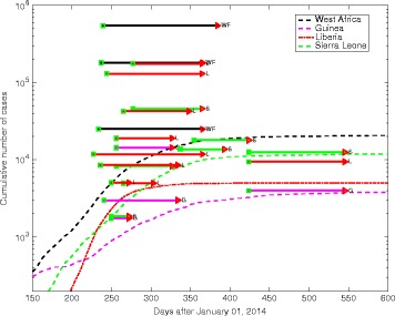
Fig. 1.

Observed trajectory of the Ebola epidemic in the three most affected countries of West Africa against predictions made in the midst of the outbreak. The colored horizontal lines represent model predictions for Guinea (G), Liberia (L), Sierra Leone (S), or all three countries combined (WF); the beginning of the line is when the prediction was made, whereas the end of the line marks the date the prediction is for (thus, shorter horizontal lines illustrate near-term predictions, while longer lines illustrate further time horizons). Data taken from JP Chretien’s Elife review [4]
