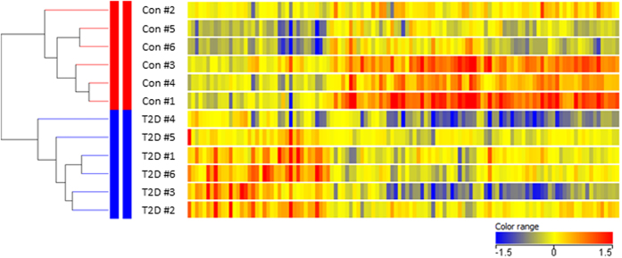
Figure 1. Heat map of the 117 genes differentially expressed genes between controls and type 2 diabetic subjects.
Fold change in gene expression is color coded: red: expression higher than the median of all samples; blue: expression lower than the median of all samples; yellow: median expression. Supervised hierarchical clustering was performed vertically in samples and horizontally in genes. As illustrated by the dendrogram, the analysis identified two distinct clusters separating healthy subjects from patients with type 2 diabetes. The length of the lines indicates the degree of separation between the clusters.

