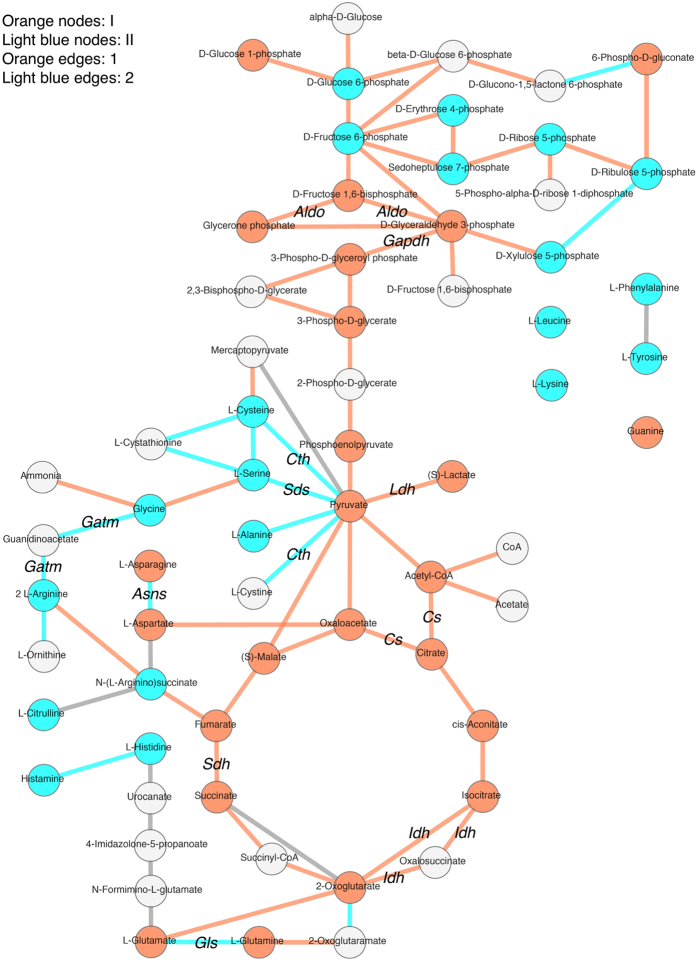
Figure 5. PathPod mapping for data extracted from clusters 1, 2, I, and II from data from the control culture.
The positions in the metabolic pathway of each metabolite and gene in clusters 1, 2, I, and II as shown in Fig. 4 were visualised by using the PathPod mapping system. Nodes show metabolites, and edges show genes. Metabolites and genes from clusters I and 1 are tagged in orange, while those from clusters II and 2 are tagged in light blue. Metabolites and genes absent from this analysis are shown in white and grey, respectively.

