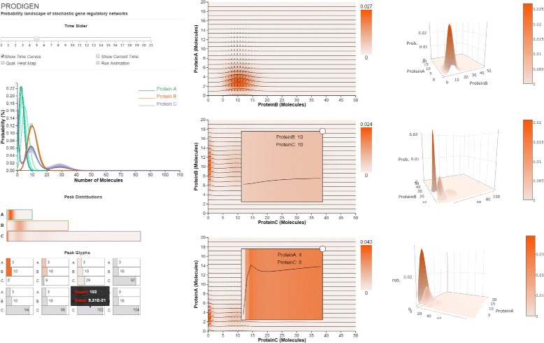
Fig. 1.

The PRODIGEN interface consists of several visual components: (left top) the ensemble Spaghetti Plots view shows the probability distribution over time, for all the proteins in a system; (left middle) the 1D heatmap view shows a per-protein view of the probability peaks; (left bottom) the Peak Glyph view (displayed as a small multiple) represents all the probability peak states in the system; (center) the 2D heatmap view is enhanced with time-curves, and shows the probability peak correlation between protein pairs over space and time; (right) the animated 3D Surface view describes the shapes of peaks over space and time
