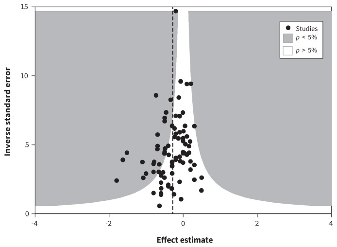
Figure 4:
Contour funnel plot using glycated hemoglobin levels at 4–12 months. Each trial’s precision (the inverse of the standard error of each study’s effect estimate) is plotted against each trials’s effect estimate. This funnel plot appears mildly asymmetric about the vertical dashed line (the fixed-effects pooled estimate). There are 3 statistical outliers that appear in the far right of the plot. The emptier left side of the inverted funnel may indicate small missing studies. Because most of these missing studies would be within the white region, they would be nonsignificant, which would indicate publication bias rather than some form of heterogeneity.

