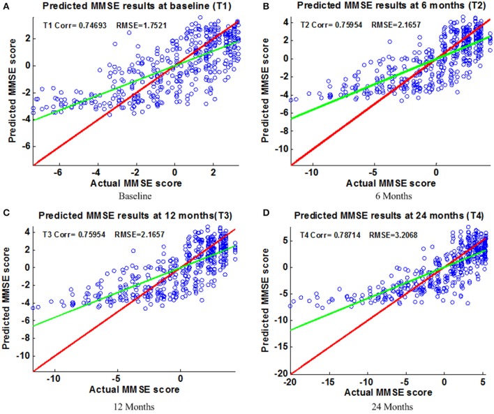
Figure 6.
Scatter plots of predicted vs. actual MMSE values at different time points; (A) Baseline (B) 6 Months (C) 12 Months (D) 24 Months. The red line in each figure is a reference of perfect correlation. The green line is the regression line with the proposed model. The closer between the regression line and reference line, the better prediction the proposed model can achieve. A high correlation is observed for MMSE prediction at each time point.

