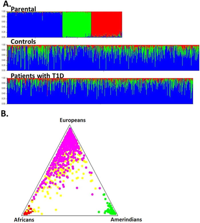
Figure 1. Graphical representations of individual contributions generated by Structure software, assuming k = 3 populations.

(A) Bar plot showing the African (red), European (blue) and Amerindian (green) contributions. Each column represents an individual, with his grouped populations. The three groups of the first bar-plot represent the parental populations (European, African and Amerindian); (B) Tri-plot showing parental populations grouped at the corners and cases and controls around the triangle according to their ancestors. Pink circles represent patients with T1D and yellow circles represent control individuals.
