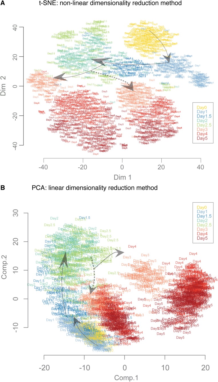
Fig. S2.
Comparison of dimensionality reduction algorithms to visualize the trajectories and transitions. We compared the data projections based on 1,934 single-cell gene expression profiles using three different dimensionality reduction methods. Results from diffusion maps are described and discussed in the text: (A) t-SNE—a nonlinear method—and (B) principle component analysis (PCA)—a linear method. The cells are represented by labels according to the collection day. The arrows indicate the general direction of progression of differentiation. The broken line arrows indicate the branching of En lineage from PS-like population.

