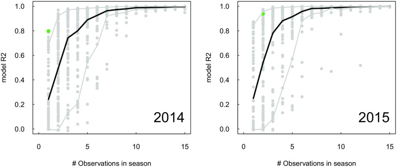
Fig. S2.
Relationship between adjusted for a model to predict simulated yields from simulated GCVI and the number of dates of observations used in the model. Each gray circle represents a different random sample of observation dates, and solid lines show mean (black line) or 5–95% confidence interval (gray lines). Green circle corresponds to dates of actual imagery acquired in each year.

