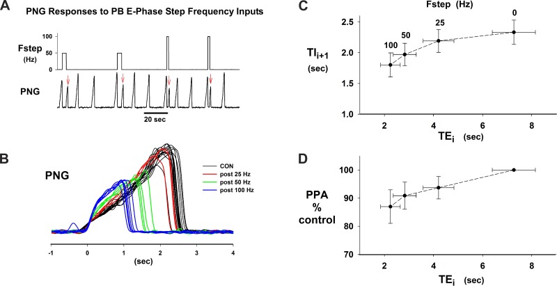
Fig. 5.
I phase effects following PB subregion stimulation during the preceding E phase. A: chart record illustrating poststimulus effects on the PNG pattern (red arrows). B: superimposed PNGs from protocol shown in A. Note decrease in Ti and peak PNG as a function of Fstep. C: plot of Ti (Tii+1) vs. the previous Te (Tei) for group data. Fstep stimulus frequency is indicated above corresponding Te values. D: group data plot of peak PNG (PPA) vs. Te for the I phase following the stimulated E phase. Data in C and D are from the same 15 dogs.

