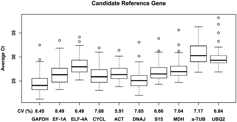
Figure 1.
Box plot representing the expression profiling variations of each candidate reference gene. The primer pairs of each gene were used to examine all samples (n = 24; Table 1). Boxes indicate the 25th and 75th percentiles; lines across the box represent the median Ct-values; whisker caps represent the minimum and maximum values; and spots represent the outliers.

