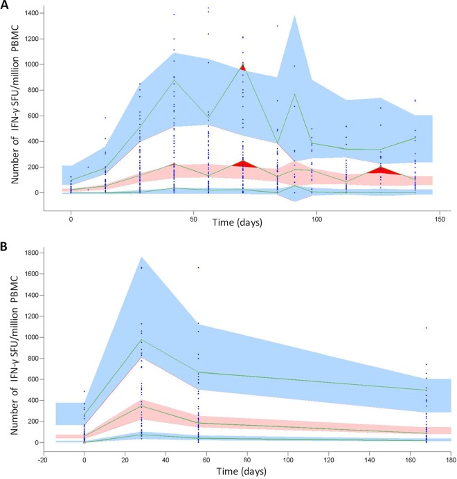
FIG 2.
VPC plots showing the number of IFN-γ SFU per million PMBC, by time (days) for all macaques (A) and all humans (B). The VPC plot assesses the appropriateness of the proposed mathematical model (Fig. 1) for describing the empirical data by comparing the data simulated using the model, the population mean parameters, and associated variances (Table 1) to the empirical data distribution (see the supplemental material for more details). Blue points show empirical data. Pink regions represent the ranges of the medians of the simulated data for 500 simulations. Blue regions represent the ranges of the 90th and 10th percentiles of the simulated population data. The green lines link the empirical percentiles (10th, 50th, and 90th). Dark red regions show where the empirical data fall outside the ranges of the simulated percentiles. The lack of dark red regions (aside from cases in which data are variable between time points in macaques) indicates that our proposed mathematical model (Fig. 1) adequately represents the empirical data.

