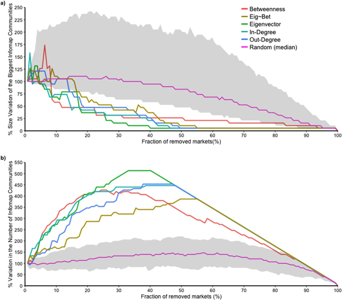
Figure 7.

Effectiveness of targeted removal of nodes over the size of the biggest communities (a) and over the number of communities (b) in the cattle trade network. The y axis shows the percentage variation in the size of the biggest communities (a) and in the number of communities (b) of nodes within the network and the x axis shows the percentage of node removal. The effect of node discharge, driven by the different centrality measures on the number of communities present in the network, is shown by different colors: betweenness centrality in red, eigenvector in light orange, in-degree in light blue, out-degree in purple and the residuals from the regression of betweenness over eigenvector centrality in light green. Random removal of nodes over 1000 simulations is shown by the median value (pink line) and its 95% range (gray shaded area).
