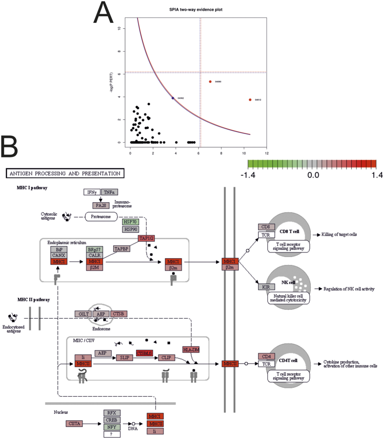
Figure 2.
(A) Signaling Pathway Impact Analysis (SPIA) evidence plot (blue curve, FDR 10% cut-off; cf. Table 2) and (B) the KEGG pathway-plot for the “Antigen processing and presentation” pathway (ID 4612; color of nodes: red, positively correlated and green, negatively correlated to the PD-L1 abundance). (http://www.kegg.jp/kegg/kegg1.html 19).

