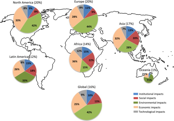
Figure 1.

Regional distribution of the analysed impacts, reported as fraction of impacts within each category of all impacts analysed in each region. Percentage numbers after the region's name indicate the share of this region in the total of impacts considered and determine the size of the circle. Percentage numbers in the pies indicate the share of impacts each category contributes to the total number of impacts reported in the respective region. For all regions, the most reported social impact is food security; all other social impacts follow far behind. The outline map is from http://www.zonu.com/images/0X0/2009-11-05-10853/World-outline-map.png.
