Fig. 4.

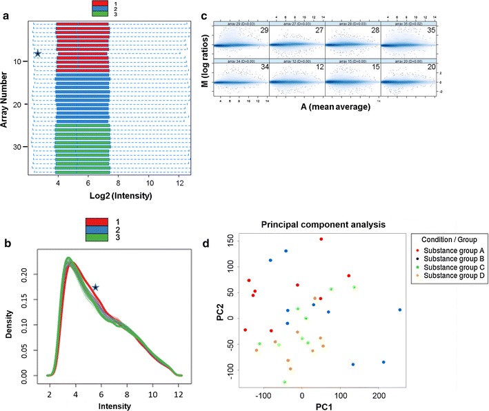
Genome-wide gene expression analysis as a follow-up endpoint of RNA from human PCLS. Bioinformatic quality assessment of 36 microarrays. Legend color red belongs to donor 1, blue to donor 2, and green to donor 3. a Box plots of array signal intensity distributions, where each box corresponds to one array. Signal intensities are in log2 scale (after RMA normalization). Medians are shown as a blue line within the boxes. One array (array 8) exceeded the threshold; it was considered an outlier and marked with an asterisk. b Density histograms of the microarrays. Signal intensities are in log2 scale (after RMA normalization). The curves of the individual donors are superimposed. Density distribution of one array (array 8, donor 1), marked with an asterisk, shows a shift to the right. c Eight MA plots of normalized gene expression data. The figure shows the four highest values of Hoeffding’s statistic and the four lowest ones. Da values are given in the Ma plot headers. No array showed a Da > 0.15, and none were marked as outliers. d Principal component analysis of four different substance groups (a–d). The two-dimensional scatter plot shows homogeneity of all groups for the first two principal components
