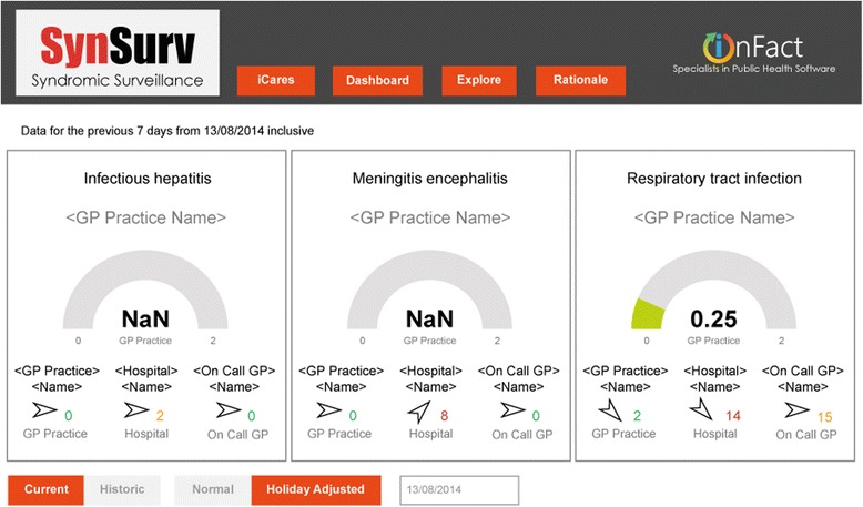
Fig. 1.

Dashboard on 13 August 2014 during meningoencephalitis outbreak. Dial numbers are incident ratios: the ratio between the observed previous 7 days incident rate with the equivalent historic incident rate. Rates are calculated as the numbers of incidents per 100,000 as based upon the GP practice’s population data. The dial color is set as green for an incident ratio of less than 0.75, orange for between 0.75 and 1.40 and red for greater than 1.40. Dials are limited to GP practices as these are the only ones where population data is available. Colored numbers are absolute incident counts for the last 7 days for a given institution. The institution that is displayed, is the one with the largest incident ratio. This is the ratio between observed and historic using rate values if available, otherwise absolute counts. The color is determined in a similar manner to the dial color. Trend arrows are determined from the ratio between the current week’s (previous 7 days) observed incident rate (or observed absolute incident count if rate not available) and the same value as calculated for the previous week. The trend arrow reflects current week versus previous week. A rising trend is shown for ratios greater than 1.1, stable for between 0.9 and 1.1, and falling for less than 0.9. NaN = Not a Number. NaN is displayed when the equivalent historic 7 day period has zero cases. A ratio would result in a divide by zero error
