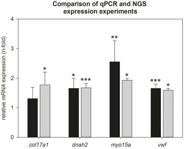
Figure 3.

Comparison of NGS- and qPCR data during torpor entrance. Expression changes were calculated by comparison of torpid animals at ZT1 to normothermic animals at ZT1 in both experiments. Gray bars represent torpid animals at ZT1(±SEM) analyzed by NGS and black bars represent torpid animals at ZT1(±SEM) analyzed by qPCR. Significant differences to their relative control groups are marked with *p < 0.05, **p < 0.01, ***p < 0.001.
