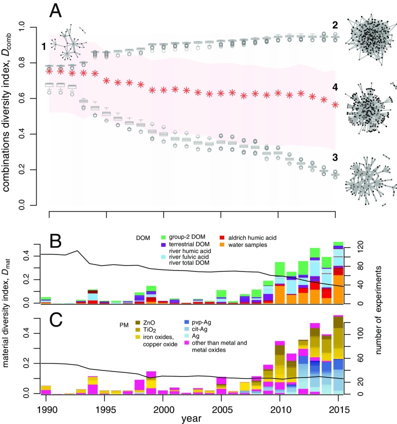
Fig. 3.
Temporal changes in the diversity of the materials studied. (A) Diversity index of the DOM–PM combinations, , as a function of time. Network 1 represents the experimental field in 1990 and is the starting point for the simulated networks. Network 2 is the expected structure of the experimental field in 2015, when the diversity of the DOM and PM was simulated to be high during 1990–2015. Network 3 is the result of simulating low diversity during this period. Boxplots represent distributions of for 1,000 simulated networks in each year. Network 4 is the current empirical network; red asterisks represent the change in of the empirical network. The light red band shows the variation in as a result of either a finer (upper bound) or coarser (lower bound) categorization of DOM types. The left vertical axis in B shows the material diversity index, , of DOM as a function of time. Bars in B show the number of experiments in each year (right vertical axis); the color code indicates different DOM types, and the legend shows DOM types mentioned in the text. The left vertical axis in C shows the material diversity index, , of PM as a function of time. Bars in C show the number of experiments in each year (right vertical axis); the color code indicates different PM types, and the legend lists some of the most-used PM types between 2012 and 2015.

