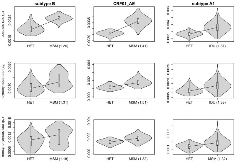
Figure 1. Violin plot representation of the risk group evolutionary rates.
HET, MSM and IDU label the estimate of the evolutionary rate for the respective risk group. The means of each rate estimate are indicate by a white circle. Numbers between brackets indicate the fold increase of the mean relative to the HET mean rate estimate. All rates are in units of nucleotide substitutions per site per year * 10−3.

